Brand Identity & packaging design for Ankly Foodservice brand for Royal A-Ware
Ankly by Royal A-ware: Brand Identity and Packaging Design
At Stepfive, we’re proud to present our latest project in brand development and packaging design: the creation of the brand identity and packaging for Ankly, the new foodservice A-brand from Royal A-ware.
Throughout this inspiring process, we applied our expertise to develop a distinctive brand that aligns perfectly with the needs and expectations of professional chefs.
Our Approach to Brand Development and Packaging Design
1. Brand Identity & Logo
The brand name Ankly is short, strong, and internationally recognizable.
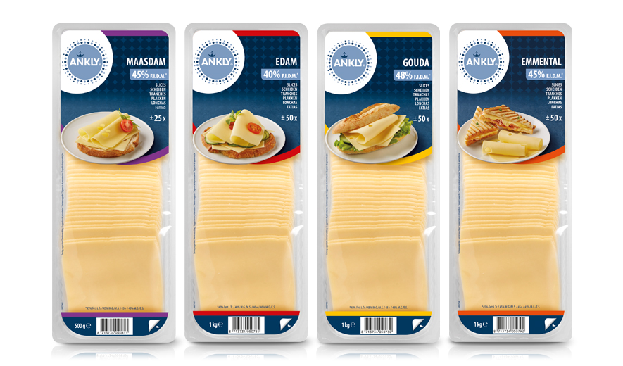
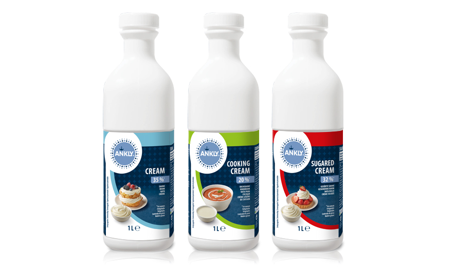
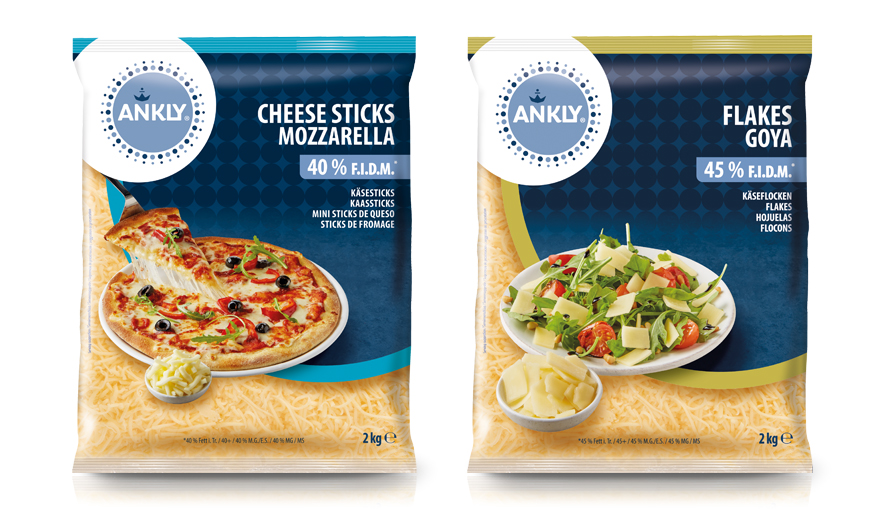
The circular logo symbolizes the kitchen — the beating heart of foodservice. The light and dark blue dots represent the collaboration between farmers, producers, and chefs — a chain working together toward perfection.
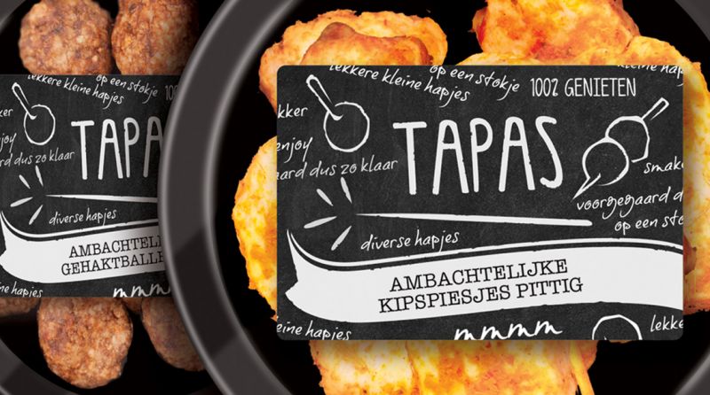
Creative & Functional Packaging Design
Our packaging design combines professionalism and simplicity, with a visual presence that instantly builds trust among chefs and buyers.
Key elements include:
Clear color coding per product category for quick recognition
Graphic details that highlight quality and craftsmanship
Timeless, no-nonsense design that fits the professional kitchen
The Result?
A brand that stands out for its reliability, simplicity, and quality — with a visual identity that resonates with food professionals and supports them in their daily work.
In Need of a Strategic Partner for Branding and Packaging?
Looking to grow your brand with a powerful identity and impactful packaging design?
At Stepfive, we support you from brand strategy through to packaging execution.
Contact us today to explore how we can help your brand stand out.